MY UX PROCESS

Case study - Qualitas car insurance

The challenge of this project was to redesign its old quote, making it easier for its users to make a quote, in addition to obtaining the data of their potential customers to contact them in case the process is not completed, thus strengthening their database.

For this project I worked as a UX designer for a work team made up of 4 people, we redesigned the old quoter using the best usability practices and streamlined the process of quoting and buying auto insurance through an App.

Heuristic Analysis

We carry out a heuristic analysis of the old quoter, to evaluate the usability according to the tasks to be carried out and the profile of users who are going to use the system, seeking compliance and obtaining points for improvements.

This analysis was carried out to understand the current state of the product, and identify the points to solve according to the recognized usability principles, we found several points of improvement which we downloaded to an Excel that generated the graph shown below to be able to see the findings in a more visual way.
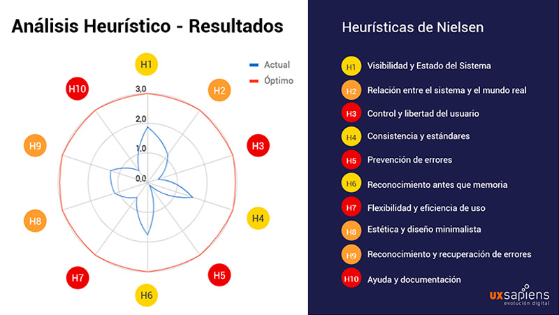
Heuristic Analysis

Competitive Analysis (Benchmark)

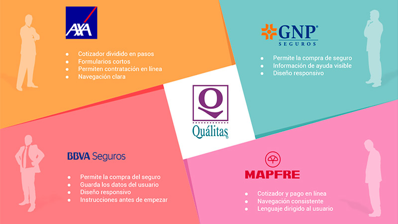
Also, each member of the team carried out a competitive analysis of different brands that offer similar products, obtaining relevant data from this to have the best practices to use and minimize possible pain or frustration for the user.

Competitive Analysis

User Research

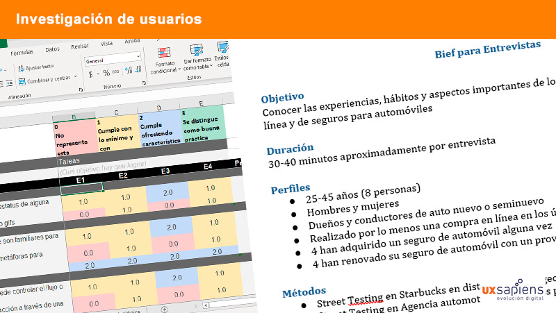
We carried out an investigation of the possible users of Qualitas in order to identify their needs and to be able to create a product that satisfies their motivations, concerns, needs and expectations, behaviors and frustrations. We also prepared a script and conducted one-on-one interviews.

Our total sample was 12 people, and we conducted 8 interviews.

User Research

User Person

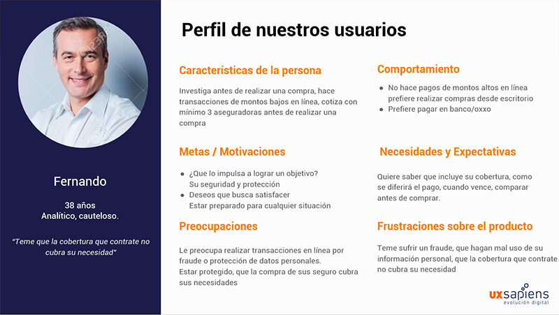
In this way we obtained the data classified into large groups, which we organized into categories that allowed us to detect patterns, which translated into people.

"Fernando" (analytical and cautious) needs to know what his insurance covers, give him clarity on the cost and make the contract quickly and safely, so we created a product that allows Fernando to configure his coverage according to his needs by showing him during the which process you are in and the total amount you will pay.

User Person

Storytelling, User Story Mapping and Sketching

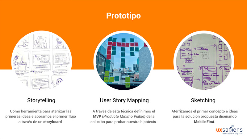
Storytelling: We carry out a storytelling as a tool to land the first ideas, we elaborate the first flow through a storyboard.

User Story Mapping: Through this technique we define the MVP (Minimum Viable Product) of the solution to test our hypothesis.

Sketching: We landed the first concept and ideas for the proposed solution by designing quick sketches of the screens and their possible flow.

Storytelling, User Story Mapping and Sketching

From Sketches to Wireframes

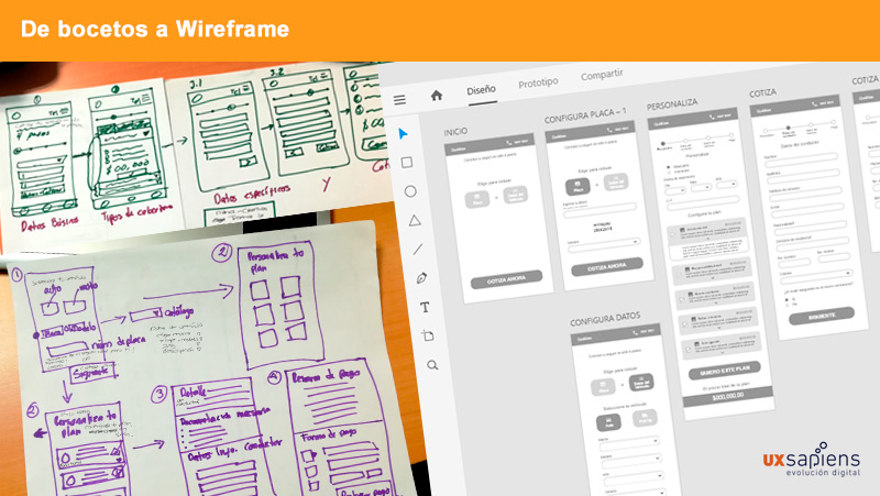
Since we had the specifications of our MVP (Minimum Viable Product) clear, it was time to decide what the digital solution would be that would improve the experience of quoting and buying your auto insurance.

We took on the task of taking all the paper sketches to the Adobe XD program to make a low-fidelity wireframe and start doing the first flow tests.

From Sketches to Wireframes

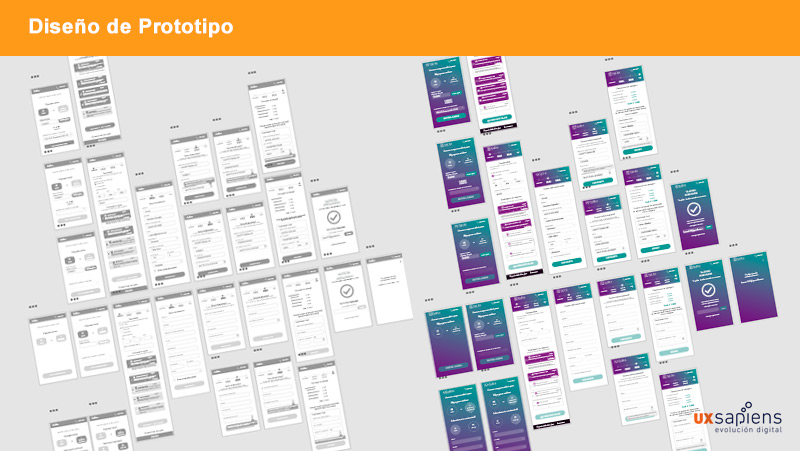
Prototype Design

Since we had a clear idea of how we wanted the app to look, buttons, screens, flows, functionalities, etc. we had to land all those ideas and take them to the digital prototype, for this we used Adobe XD.

Once all the visual part is ready, we begin to give the prototype functionality to be able to start with the final usability tests.

Prototype Design

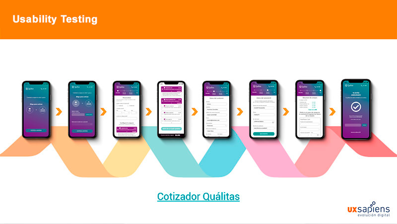
Usability Testing

When we had the prototype ready, it was time to test it to detect areas of opportunity and improvement. For this, each one of the team looked for someone who met the profile of our target, which we put in context and a scenario was proposed in which they would have to quote and buy insurance for their car.

This is how we put our prototype to the test and tested buttons, functionality, flows and accessibility.

Test the application >>

Usability Testing
Conclusion

A functional prototype was designed in which both the client and the users can see screens, flows and functionalities which are the visual and tangible result of the investigation.

Based on the results of the previous investigation, we arrived at this solution, since by analyzing the characteristics of our User Persona, we obtained clues that led us to design something for users like "Fernando" (analytical and cautious) who is concerned about covering all your needs safely and without paying more.

LET'S TALK

Write me an email, I will be happy to answer you!

Thank you! I will contact you soon.